

Web-Development-Applications PDF Dumps Real 2025 Recently Updated Questions
Released WGU Web-Development-Applications Updated Questions PDF
NEW QUESTION # 20
Given the following markup:
Where does the image align in relation to the text?
- A. The lop of the image aligns the bottom of Hello world.
- B. The bottom of the Image aligns to the bottom of Hello World
- C. The top of The image aligns to the top of Hello World
- D. The bottom of the image aligns to the top of Held world.
Answer: B
Explanation:
The CSS property vertical-align: baseline aligns the baseline of the element with the baseline of its parent. For inline elements like images, the baseline alignment means that the bottom of the image aligns with the bottom of the text.
* CSS vertical-align Property:
* Baseline Alignment: Aligns the baseline of the element with the baseline of its parent.
* Example:
<p>Hello World<img src="sample.jpg" style="vertical-align:baseline"></p>
* Analysis:
* The <img> element with vertical-align: baseline will align its bottom with the bottom of the surrounding text "Hello World".
* References:
* MDN Web Docs - vertical-align
* W3C CSS Inline Layout Module Level 3
NEW QUESTION # 21
Which code segment contains a conditional expression?
- A.

- B.

- C.

- D.

Answer: D
Explanation:
A conditional expression in JavaScript is an expression that evaluates to a boolean value and controls the execution flow based on its result. The conditional (ternary) operator ? : is used for conditional expressions.
* Example Analysis:
* Option A:
var result = dataCount;
* This is a simple assignment, not a conditional expression.
* Option B:
var result = count++ > 10;
* This is a comparison but not a complete conditional expression.
* Option C:
var result = dataCount++ * 1000 == 3000000;
* This is an arithmetic operation followed by a comparison but not a complete conditional expression.
* Option D:
javascript
Copy code
var result = count >= 10 ? "Done" : getResult();
* This is a conditional (ternary) expression. If count is greater than or equal to 10, result will be "Done", otherwise, it will call getResult().
* References:
* MDN Web Docs - Conditional (ternary) operator
* W3Schools - JavaScript Conditions
NEW QUESTION # 22
Which code segment correctly defines a function in JavaScript?
- A. Function addNumber (in a, int b)
- B. Void addNumbers(a, b)
- C. Function addNumbers (a, b)
- D. Void addNumber(int a, int b)
Answer: C
Explanation:
In JavaScript, functions are defined using the function keyword followed by the name of the function, a set of parentheses (), and a block of code enclosed in curly braces {}.
* Function Definition Syntax:
* Correct Syntax:
function addNumbers(a, b) {
// function body
}
* Explanation:
* function: Keyword to define a function.
* addNumbers: Name of the function.
* (a, b): Parameters for the function.
* { ... }: Function body containing the code to be executed.
* Incorrect Options:
* A. Void addNumbers(a, b): JavaScript does not use void to define functions.
* C. Void addNumber(int a, int b): JavaScript does not use void or type declarations (int).
* D. Function addNumber (in a, int b): JavaScript functions do not use type declarations.
* References:
* MDN Web Docs - Functions
* W3Schools - JavaScript Functions
NEW QUESTION # 23
Given the following HTML code:
Which line of code should replace the first line to ensure that users can pause and restart the video?
- A.

- B.

- C.

- D.

Answer: B
Explanation:
To ensure that users can pause and restart the video, the controls attribute needs to be added to the <video> tag. This attribute provides the user with controls to play, pause, and adjust the volume of the video. The correct line of code that should replace the first line in the provided HTML to achieve this functionality is:
<video width="360" height="270" controls>
Here's the comprehensive explanation:
* controls Attribute: The controls attribute is a boolean attribute. When present, it specifies that video controls should be displayed, allowing the user to control video playback, including pausing, playing, and seeking.
* HTML Structure:
* Original Line:
<video width="360" height="270">
* Revised Line:
<video width="360" height="270" controls>
* Usage Example:
<video width="360" height="270" controls>
<source src="video.mp4" type="video/mp4">
Your browser does not support the HTML5 video element.
</video>
In this example, adding the controls attribute provides the user with play, pause, and volume controls.
References:
* MDN Web Docs on <video>
* W3C HTML5 Specification on <video>
NEW QUESTION # 24
What represents the value of the pattern attribute of an input element in an HTML
- A. A JavaScript function
- B. A SQL statement
- C. A style sheet
- D. A regular expression
Answer: D
Explanation:
The value of the pattern attribute in an input element is a regular expression. This regular expression is used to define what constitutes a valid value for the input.
* Regular Expressions: Regular expressions (regex) are sequences of characters that define search patterns. They are commonly used for string matching and validation.
* Usage Example:
<input type="text" pattern="\d{5}" placeholder="Enter a 5-digit number"> Here, the pattern attribute value is a regular expression that validates a five-digit number.
References:
* MDN Web Docs on pattern
* Regular Expressions Documentation
NEW QUESTION # 25
A web page has the following CSS code: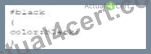
Which selector should a developer use to invoke the CSS?
- A. Style
- B. class
- C. id
- D. Attribute
Answer: C
Explanation:
To invoke the CSS provided, an ID selector is used. In CSS, the ID selector is used to style the element with the specific id attribute.
* CSS ID Selector: The syntax for the ID selector is #id, where id is the id attribute value of the HTML element.
* Usage Example:
#black {
color: black;
}
This CSS rule will apply the color: black; style to the element with id="black".
* Example in HTML:
<div id="black">This text will be black.</div>
References:
* MDN Web Docs on ID Selectors
* W3C CSS Specification on Selectors
NEW QUESTION # 26
What is the used to render images dynamically?
- A. Canvas
- B. MPEG-4
- C. Ogg
- D. H.264
Answer: A
Explanation:
The <canvas> element in HTML5 is used to render images and graphics dynamically through JavaScript. It is a powerful feature for creating graphics, game visuals, data visualizations, and other graphical content directly in the browser.
* Canvas Element: The <canvas> element is an HTML tag that, with the help of JavaScript, can be used to draw and manipulate graphics on the fly.
* Usage Example:
<canvas id="myCanvas" width="200" height="100"></canvas>
<script>
var canvas = document.getElementById("myCanvas");
var ctx = canvas.getContext("2d");
ctx.fillStyle = "#FF0000";
ctx.fillRect(0, 0, 200, 100);
</script>
In this example, a red rectangle is drawn on a canvas element.
References:
* MDN Web Docs on <canvas>
* W3C HTML Canvas 2D Context Specification
NEW QUESTION # 27
Given the following code:
Var a = ''true'';
What is the data type of d?
- A. String
- B. Boolean
- C. Object
- D. Undefined
Answer: A
Explanation:
The data type of the variable a is determined by the value assigned to it. In JavaScript, if a value is enclosed in double or single quotes, it is treated as a string.
* Variable Assignment:
* Given the code:
var a = "true";
* The value "true" is enclosed in double quotes, making it a string.
* Explanation:
* Option A: Boolean is incorrect because the value "true" is a string, not a boolean.
* Option B: String is correct because the value is enclosed in double quotes.
* Option C: Object is incorrect because the value is a primitive string.
* Option D: Undefined is incorrect because the variable a is assigned a value.
* References:
* MDN Web Docs - JavaScript Data Types
* W3Schools - JavaScript Data Types
NEW QUESTION # 28
What is an advantage that a mobile has over a mobile app?
- A. It is automatically available to all users
- B. It is automatically awe to access all device capabilities
- C. It has full control of the user interface
- D. It is fully functional offline.
Answer: A
Explanation:
A mobile website has the advantage of being automatically available to all users without the need for installation. Users can access it through their web browsers on any device with internet connectivity.
* Accessibility: Mobile websites can be accessed by simply entering a URL in a web browser. There is no need to visit an app store and install an application.
* Cross-Platform Compatibility: Mobile websites are designed to work across various devices and platforms, ensuring a broader reach.
* Automatic Updates: Updates to mobile websites are immediately available to users without requiring them to download and install new versions.
References:
* MDN Web Docs on Responsive Web Design
* W3C Mobile Web Application Best Practices
NEW QUESTION # 29
What is the default behavior of overlay elements?
- A. Last element listed appears on bottom
- B. Last element listed appears on top
- C. First element listed is transparent
- D. First element listed is invisible
Answer: B
Explanation:
In CSS, when elements overlap, the default behavior is that the last element listed in the HTML document appears on top.
* Stacking Context:
* Default Behavior: Elements are stacked in the order they appear in the HTML. The last element in the document tree is rendered on top.
* z-index: You can control stacking order using the z-index property, but without it, the default order applies.
* Example:
* Given HTML:
<div style="position: absolute; width: 100px; height: 100px; background-color: red;"></div>
<div style="position: absolute; width: 100px; height: 100px; background-color: blue;"></div>
* The blue div will be on top of the red div because it appears later in the HTML document.
* References:
* MDN Web Docs - Stacking context
* W3C CSS Positioned Layout Module Level 3
By understanding these fundamental CSS concepts, developers can create more effective and visually appealing web layouts.
NEW QUESTION # 30
Which attribute displays help text in an input field without specifying an actual value for the input?
- A. name
- B. Placeholder
- C. For
- D. Default
Answer: B
Explanation:
The placeholder attribute in an <input> element displays help text in the input field without specifying an actual value for the input. This text disappears when the user starts typing.
* Placeholder Attribute: This attribute provides a hint to the user about what type of information is expected in the field.
* Usage Example:
<input type="text" placeholder="Enter your name">
The input field will show "Enter your name" as help text.
References:
* MDN Web Docs on placeholder
* W3C HTML Specification on Input Placeholder
NEW QUESTION # 31
What should a developer increase to create space between a border and content?
- A. Padding
- B. Height
- C. Margin
- D. Width
Answer: A
Explanation:
Padding is the CSS property used to create space between the content of an element and its border. It is an internal spacing within the element.
* CSS Box Model:
* Content: The innermost part, where text and images appear.
* Padding: The space between the content and the border.
* Border: The edge of the element.
* Margin: The space outside the border, creating space between different elements.
* Usage:
* Padding:
div {
padding: 20px;
}
* This code adds 20 pixels of padding on all sides of the content within the div element.
* References:
* MDN Web Docs - Padding
* W3C CSS Box Model
NEW QUESTION # 32
What should be used to request and Update data in the background?
- A. DOM
- B. AJAX
- C. Canvas
- D. API
Answer: B
Explanation:
AJAX (Asynchronous JavaScript and XML) is used to request and update data in the background without reloading the web page.
* AJAX Overview:
* Purpose: Allows web pages to be updated asynchronously by exchanging data with a web server behind the scenes.
* Benefits: Provides a smoother user experience by avoiding full page reloads.
* Example:
* Using XMLHttpRequest:
var xhr = new XMLHttpRequest();
xhr.open("GET", "data.json", true);
xhr.onreadystatechange = function() {
if (xhr.readyState === 4 && xhr.status === 200) {
var data = JSON.parse(xhr.responseText);
console.log(data);
}
};
xhr.send();
* References:
* MDN Web Docs - AJAX
* W3Schools - AJAX Introduction
NEW QUESTION # 33
Given the following CSS statement:
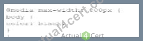
Which code segment changes the font color when the viewport is 800 pixels wide or wider?
- A.
- B.

- C.

- D.

Answer: C
Explanation:
To change the font color when the viewport is 800 pixels wide or wider, a media query with min-width:
800px is used. This ensures that the styles inside the media query are applied only when the viewport width is at least 800 pixels.
* CSS Media Queries:
* Syntax for Media Query:
@media screen and (min-width: 800px) {
body {
color: black;
}
}
* Explanation: The min-width: 800px condition ensures that the styles are applied when the viewport is 800 pixels or wider.
* Example Analysis:
* Option A:
@media screen and (min-width: 800px) {
body {
color: black;
}
}
* Correct. This applies the color: black; style to the body when the viewport is 800 pixels or wider.
* Option B:
@media min-width: 800px {
body {
color: black;
}
}
* Incorrect. Missing screen and which is required for a proper media query targeting screens.
* Option C:
@media screen and (max-width: 800px) {
body {
color: black;
}
}
* Incorrect. This applies the style when the viewport is 800 pixels or narrower.
* Option D:
@media max-width: 800px {
body {
color: black;
}
}
* Incorrect. This applies the style when the viewport is 800 pixels or narrower.
* References:
* MDN Web Docs - Using media queries
* W3Schools - CSS Media Queries
The correct use of media queries ensures that the specified styles are applied only under the desired conditions, providing a responsive design.
NEW QUESTION # 34
A web developer need to ensure that a message appears if the user's browser does not support the audio files on a web page.
How should this designer code the audio element?
- A.

- B.

- C.

- D.

Answer: D
Explanation:
To ensure that a message appears if the user's browser does not support the audio files on a web page, the developer should use the <audio> element correctly. The <audio> element supports fallback content, which is displayed if the browser does not support the specified audio formats.
* Correct Usage:
* Fallback Content: Place the message as fallback content inside the <audio> element. Browsers that do not support the audio format will display this message.
* Example:
<audio>
<source src="audio/song.mp3" type="audio/mpeg" />
No mpeg support.
</audio>
* Explanation of Options:
* Option A: Incorrect. The alt attribute is not valid for the <source> element.
* Option B: Incorrect. The alt attribute is not valid for the <audio> element.
* Option C: Incorrect. The alt attribute is used incorrectly in the <audio> element.
* Option D: Correct. The message "No mpeg support." is placed correctly as fallback content inside the <audio> element.
* References:
* W3C HTML5 Specification - The audio element
* MDN Web Docs - <audio>
Using the fallback content inside the <audio> element ensures that users with unsupported browsers receive a meaningful message, improving the overall user experience.
NEW QUESTION # 35
Given the following HTML statement:
And the following style:
Which line of the changes the background color of the <div> tag when the width is between 600 pixels and
900 pixels or more than 1, 100 pixels?
- A.

- B.

- C.

- D.

Answer: D
Explanation:
The given HTML and CSS statements define a class named "example" and use media queries to change the background color of the <div> element based on the screen width. The correct CSS media query to change the background color of the <div> tag when the width is between 600 pixels and 900 pixels or more than 1100 pixels is:Copy code
@media screen and (max-width: 900px) and (min-width: 600px), (min-width: 1100px) { div.example { background: yellow;
}
}
* Understanding Media Queries:
* @media screen: Applies the styles only for screens.
* (max-width: 900px) and (min-width: 600px): Targets screen widths between 600 and 900 pixels.
* , (comma): Acts as an "or" operator in media queries.
* (min-width: 1100px): Targets screen widths greater than or equal to 1100 pixels.
* Option C Explanation:
* This option uses the correct media query syntax to apply the background color change when the screen width is between 600 and 900 pixels or when it is 1100 pixels or more.
References:
* MDN Web Docs on Media Queries
* W3C CSS Media Queries Level 4
The correct CSS media query based on the provided options is:
@media screen and (max-width: 900px) and (min-width: 600px), (min-width: 1100px) { div.example { background: yellow;
}
}
References for Media Queries:
* MDN Web Docs on Using Media Queries
* W3C CSS Media Queries Module Level 4
NEW QUESTION # 36
Which attribute is related to moving the mouse pointer of an element?
- A. Onmouseup
- B. Onmouseover
- C. onmouseenter
- D. Onmouseout
Answer: B
Explanation:
The onmouseover attribute in HTML and JavaScript is used to execute a script when the mouse pointer is moved over an element.
* onmouseover Attribute: This event occurs when the mouse pointer is moved onto an element. It is commonly used to change styles or content of the element when the user interacts with it by hovering.
* Usage Example:
<p onmouseover="this.style.color='red'">Hover over this text to change its color to red.</p> In this example, the text color changes to red when the mouse pointer is moved over the paragraph.
References:
* MDN Web Docs on onmouseover
* W3C HTML Specification on Events
NEW QUESTION # 37
Which tag is required when importing the jQuery library?
- A. Body
- B. meta
- C. Script
- D. Section
Answer: C
Explanation:
The <script> tag is required when importing the jQuery library into an HTML document.
* Including jQuery:
* Purpose: The <script> tag is used to embed or reference executable code (JavaScript).
* Example:
<script src="https://code.jquery.com/jquery-3.6.0.min.js"></script>
* Explanation:
* The <script> tag should be placed in the <head> or at the end of the <body> to ensure that the library is loaded before the scripts that depend on it.
* References:
* jQuery Getting Started
* MDN Web Docs - <script>
NEW QUESTION # 38
Given the following markup and no style sheet:
Which control does the input element render?
- A. Drop-down
- B. Text
- C. Slider
- D. Button
Answer: C
Explanation:
The type="range" attribute in an <input> element renders a slider control.
* HTML Input Type range:
* Purpose: The range type is used for input fields that should contain a value from a range of numbers.
* Example:
* Given the HTML:
<input id="range" name="range" type="range">
* Explanation:
* This will render as a slider that the user can move to select a value within a range.
* References:
* MDN Web Docs - <input type="range">
* W3Schools - HTML Input Range
NEW QUESTION # 39
A web page has a section that contains an <article> element. The element is always 10 pixels to the right of its position.
Which type of layout positioning should the <article> element use?
- A. Absolute
- B. Relative
- C. Fixed
- D. Static
Answer: B
Explanation:
Relative positioning in CSS positions an element relative to its normal position. Using position: relative; allows you to adjust the element's position with the top, right, bottom, or left properties.
* CSS Relative Positioning:
* Syntax:
article {
position: relative;
left: 10px;
}
* Description: Moves the element 10 pixels to the right from its normal position.
* Example:
* Given HTML:
<article>Content</article>
* Given CSS:
article {
position: relative;
left: 10px;
}
* Explanation: The <article> element will be positioned 10 pixels to the right of where it would normally appear.
* References:
* MDN Web Docs - position
* W3C CSS Positioned Layout Module Level 3
NEW QUESTION # 40
Which History API object is called when a browser window's document history changes?
- A. Window, open
- B. Window, location
- C. Window, onpopstate
- D. Window, name
Answer: C
Explanation:
The onpopstate event is triggered in the window object when the active history entry changes, such as when the user navigates to a different page using the back or forward buttons in the browser.
* History API and onpopstate:
* Event: window.onpopstate
* Description: This event is fired when the user navigates to a session history entry, i.e., when moving backwards or forwards in the browser history.
* Example:
window.onpopstate = function(event) {
console.log("location: " + document.location + ", state: " + JSON.stringify(event.state));
};
* Other Options:
* A. Window, location: location is an object containing information about the current URL.
* C. Window, name: name is a property to set or get the name of a window.
* D. Window, open: open is a method to open a new browser window or tab.
* References:
* MDN Web Docs - window.onpopstate
* W3Schools - JavaScript History API
NEW QUESTION # 41
Which layout design is easiest to manage on a variety of devices?
- A. Table
- B. Flow
- C. Grid
- D. Border
Answer: C
Explanation:
A grid layout is easiest to manage across a variety of devices due to its flexibility and ability to create responsive designs that adapt to different screen sizes.
* Grid Layout:
* Responsive Design: Grid layouts can be easily adjusted using media queries to provide a consistent user experience across devices.
* CSS Grid Example:
container {
display: grid;
grid-template-columns: repeat(auto-fill, minmax(200px, 1fr));
}
* Other Options:
* A. Flow: Often used for text, not layout.
* B. Table: Outdated and not responsive.
* D. Border: Not commonly used for complex layouts.
* References:
* MDN Web Docs - CSS Grid Layout
* W3Schools - CSS Grid Layout
NEW QUESTION # 42
Which layout method causes images to render to small or too large in browser windows of different sizes?
- A. Relative width
- B. Liquid
- C. Fluid
- D. Fixed width
Answer: D
Explanation:
A fixed-width layout method specifies exact pixel values for widths. This approach does not adapt to different screen sizes, leading to images rendering too small or too large on various devices.
* Fixed Width Layout:
* Definition: Uses specific pixel values for the width of elements.
* Example:
container {
width: 800px;
}
* Issues:
* Lack of Flexibility: Does not scale with the size of the viewport, causing images and other elements to appear incorrectly sized on different screen sizes.
* Comparison:
* Fluid/Liquid: Adapts to the screen size using percentages or other relative units.
* Relative Width: Also adapts using units like em or %.
* References:
* MDN Web Docs - Fixed vs. Fluid Layout
* W3C CSS Flexible Box Layout Module Level 1
Using fixed-width layouts can result in poor user experience across different devices, highlighting the importance of responsive design principles.
Top of Form
Bottom of Form
NEW QUESTION # 43
A javaScript programmer defines the following function:
What is the name of the function?
- A. Function
- B. square
- C. Return
- D. Number
Answer: B
Explanation:
In JavaScript, the name of a function is defined after the function keyword and before the parentheses that enclose its parameters.
* Function Name: The function name is the identifier used to call the function. It is defined immediately after the function keyword.
* Usage Example:
function square(number) {
return number * number;
}
In this example, the name of the function is square.
References:
* MDN Web Docs on Functions
* ECMAScript Language Specification
NEW QUESTION # 44
Which CSS transformation method should a developer use to reposition an element horizontally on the 2-D plane?
- A. Scale (x,y)
- B. Translatex(n)
- C. Scalex(n)
- D. Skewx (angle)
Answer: B
Explanation:
The translateX(n) method in CSS is used to move an element horizontally on the 2-D plane by a specified distance. This transformation repositions the element along the X-axis.
* translateX(n) Method: The translateX(n) function moves an element horizontally by n units. Positive values move the element to the right, while negative values move it to the left.
* Usage Example:
element {
transform: translateX(100px);
}
In this example, the element is moved 100 pixels to the right.
* Properties:
* n: This represents the distance to move the element. It can be specified in various units such as pixels (px), percentages (%), ems (em), etc.
References:
* MDN Web Docs on transform
* W3C CSS Transforms Module Level 1
NEW QUESTION # 45
......
Web-Development-Applications Dumps and Practice Test (69 Exam Questions): https://www.actual4cert.com/Web-Development-Applications-real-questions.html
Guide (New 2025) Actual WGU Web-Development-Applications Exam Questions: https://drive.google.com/open?id=1quqIyMzw4oRgnpS9ExAafCYlPZmTQn3G